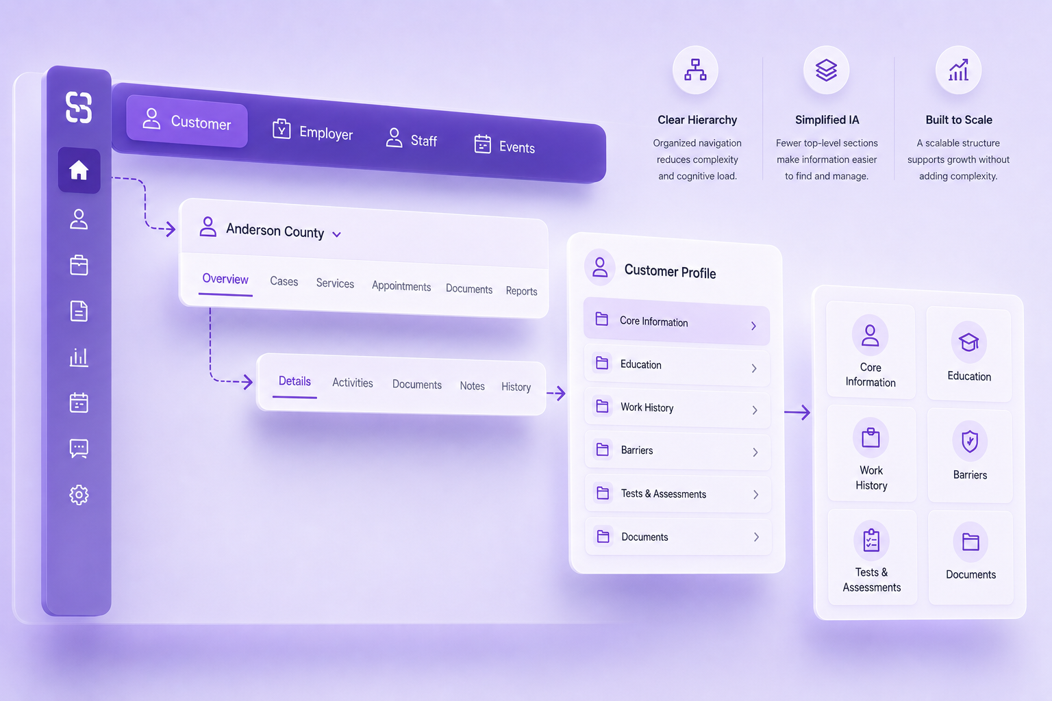
As UX Manager, I worked alongside Product and Engineering to tackle deep structural debt within a mature enterprise platform. Years of incremental development had created overlapping navigation patterns, fragmented information architecture, and increasing difficulty introducing new functionality without adding more complexity.
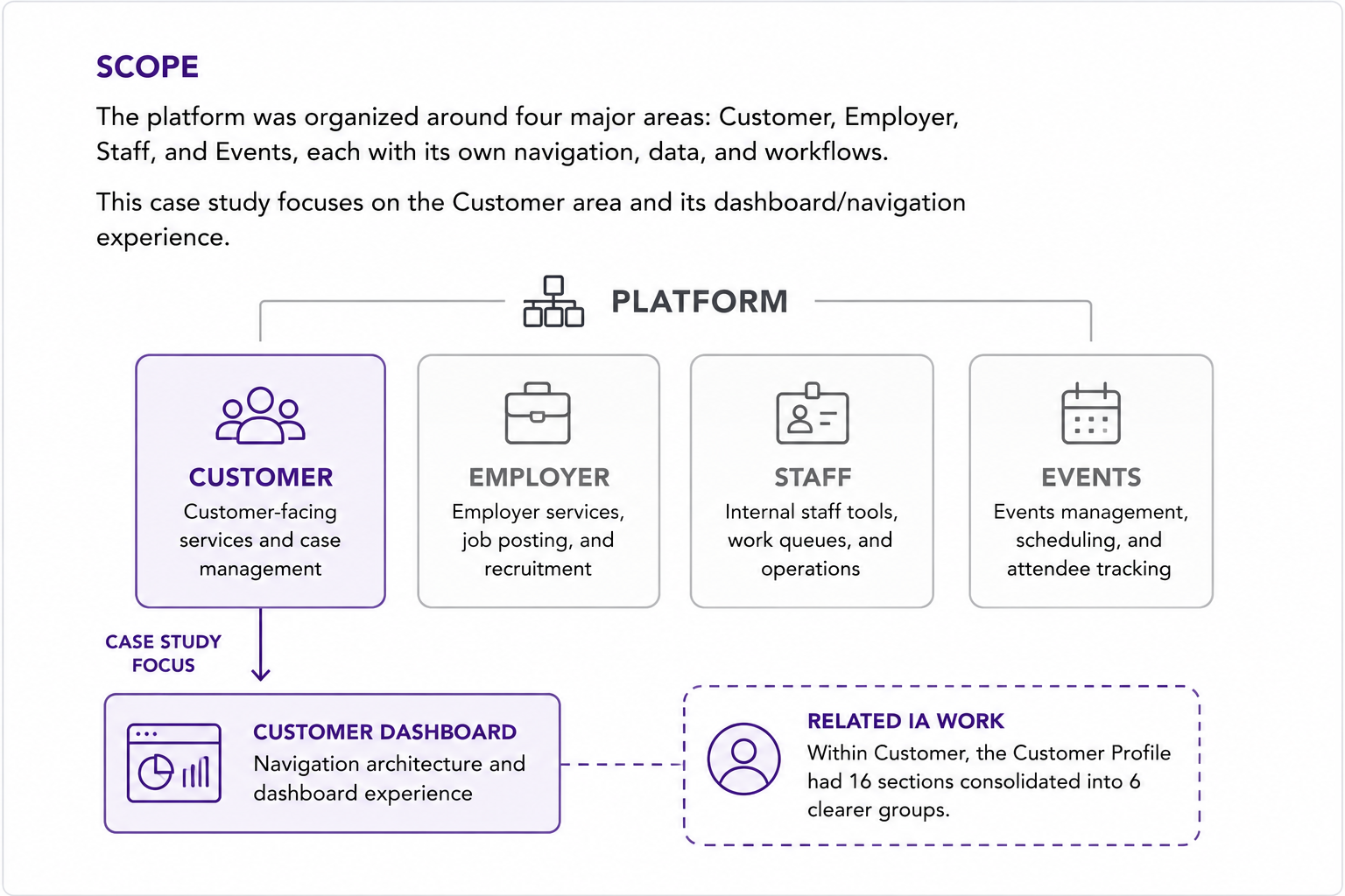
The platform was organized around four major areas: Customer, Employer, Staff, and Events, each supporting its own navigation, data, and workflows.
This case study focuses on the Customer area, specifically the Customer Dashboard and the navigation architecture surrounding it. The work also extended deeper into Customer workflows, including restructuring the Customer Profile information architecture.
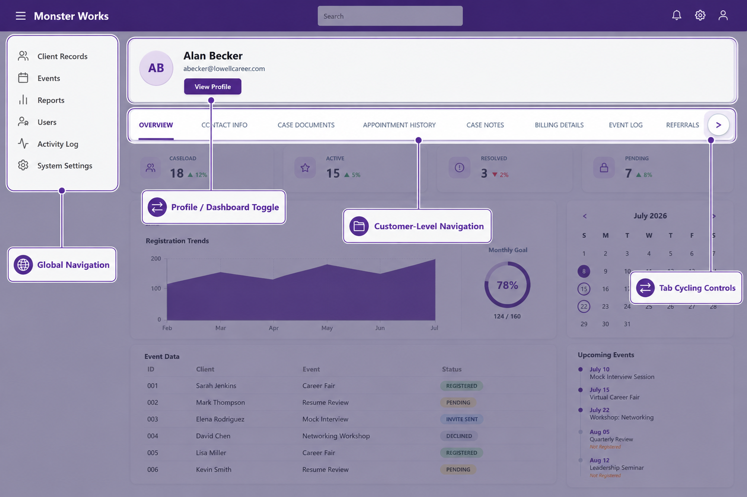
Navigation within the Customer experience had evolved incrementally rather than as a unified system. Global navigation, contextual controls, nested destinations, and increasingly granular tabs competed with one another without a clear architectural hierarchy.
New functionality often meant adding another destination or another tab. The result was increasing navigation density, hidden overflow states, and more effort required to understand where information lived. The Customer Profile alone had accumulated 16 separate top-level sections.
The problem could not be solved by replacing one navigation component with another. The underlying hierarchy first needed to become clearer, and the resulting architecture needed to support different levels of navigation without allowing navigation itself to dominate the workspace.
Note: Interface mocks and workflows shown here are simplified abstractions created to illustrate interaction principles and layout strategy. They do not reflect final production code or proprietary system data.
The navigation problem was partly structural. As features accumulated, related destinations were frequently represented as separate top-level choices rather than grouped according to the user's working context.
Moving the same fragmented structure into a new component would only relocate the problem. Within the Customer Profile, I worked with the team to consolidate 16 top-level sections into 6 functional groups before applying the new navigation model.
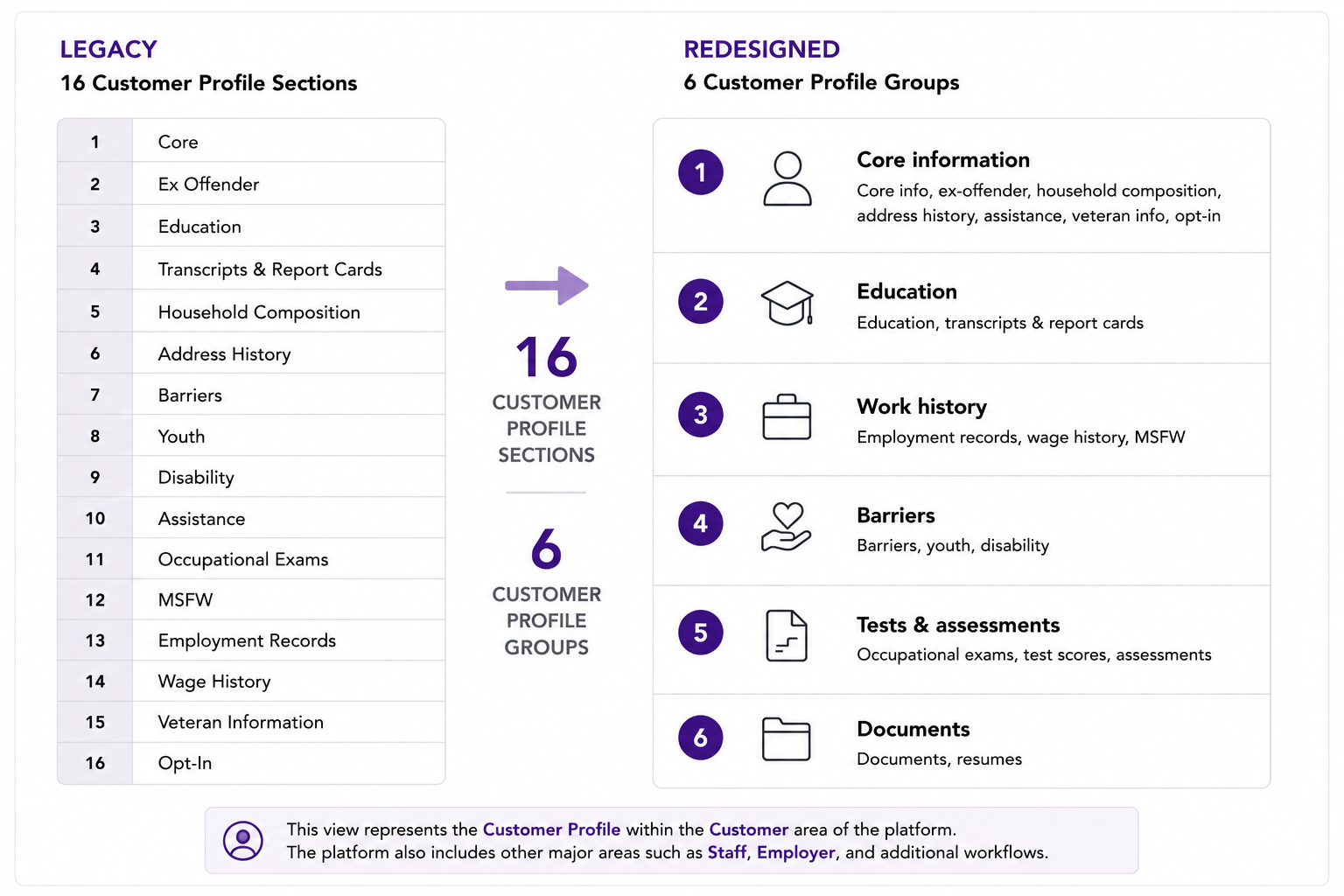
Core Information, Education, Work History, Barriers, Tests & Assessments, and Documents became the primary profile groups. This reduced the number of competing destinations before the interaction model itself was redesigned.
With the underlying structure simplified, I separated navigation responsibilities into three levels:
Breadcrumbs and persistent context cues reinforce orientation as users move deeper. Each navigation level has a specific responsibility instead of competing with the others for attention.
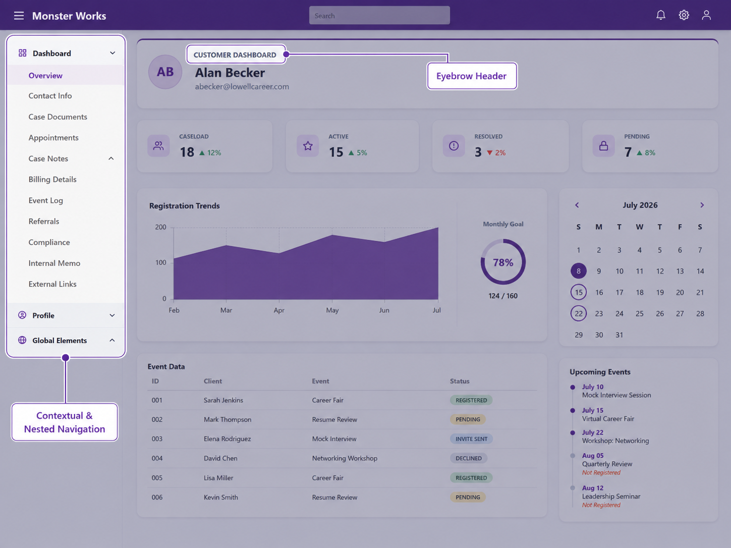
The current customer remains visible while deeper destinations are organized within that context.
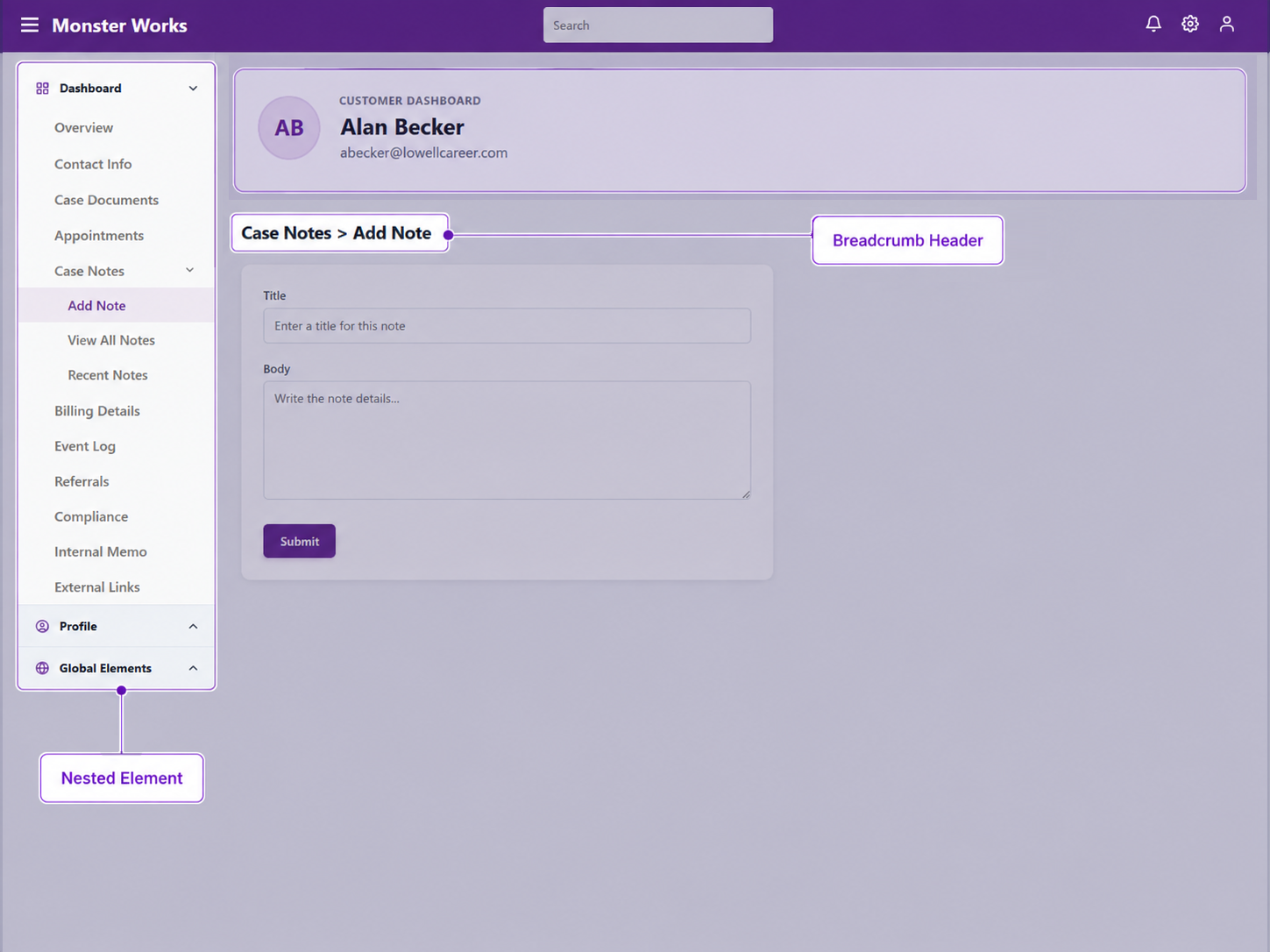
Breadcrumbs reinforce location without adding another permanent navigation layer.
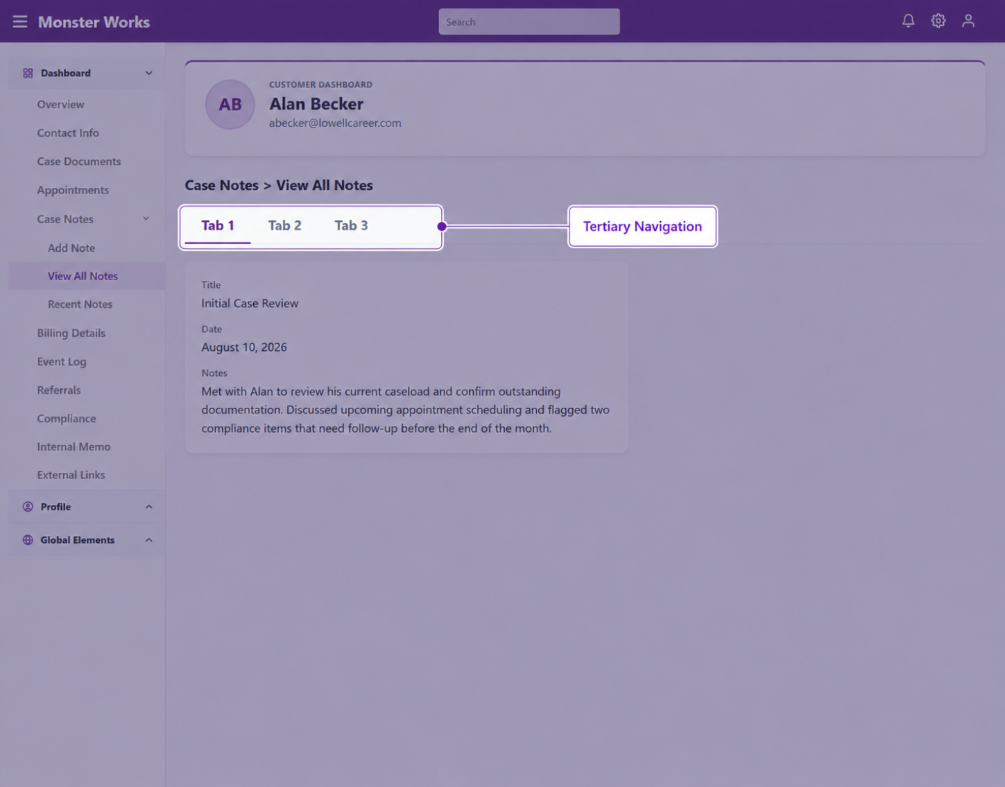
This keeps page-level navigation local and prevents another layer from spilling into the global structure.
One principle drove the spatial decisions:
Navigation should give up screen real estate before the data does.
Users frequently worked with wide tables and information-dense interfaces. Deeper navigation therefore appears when needed rather than permanently occupying horizontal workspace.
The resulting system supports a complex information architecture without allowing the navigation itself to become the dominant element of the interface.
The secondary navigation was initially conceived as a mouseover flyout, but relying on hover alone would have made the interaction fragile across input methods.
We refined the model around intentional interaction with the global navigation while supporting keyboard, click, and other input methods. This preserved the spatial efficiency of contextual navigation without making access dependent on hover.
Keep the global context visible. Reveal deeper navigation when needed. Preserve the workspace whenever possible.
We also considered a persistent panel that would push the canvas to the right whenever deeper navigation opened. It would keep sub-navigation constantly visible, but at the cost of horizontal workspace.
For a product dominated by wide tables and dense reporting interfaces, that was the wrong trade-off. We chose the lighter contextual model, accepting an additional interaction in exchange for preserving more usable workspace.
Redesigning the architecture was only part of the challenge. Introducing it into a mature platform required an incremental rollout that could expose integration problems without destabilizing core workflows.
The navigation work became a foundation for broader modernization: shared patterns, an incremental rollout strategy, and a governance model for applying them consistently.